
See the work
A TYCE handbook · Lessons 01–04
You already know when something doesn’t look right.
TYCE teaches you how to see why.
TYCE—Train Your Creative Eye—is practical visual education that helps you understand what makes creative work effective, and how to make it better.
What this is
Creative education for people who make things.
For
Designers, photographers, art directors and stylists — and founders, business owners, and anyone who directs or approves creative work without formal design training.
It teaches
Seeing, deciding, and directing creative work — and saying why, so the people around you can act on it.
By
Showing first, through free interactive lessons and concise visual handbooks. Every idea is taught in full once, then put to work. Scroll on — this page does the same.
Now, train your eye.
You do not need a design background for what follows. Start by noticing what catches your attention. Then TYCE shows you why it happened and how to use the principle in your own work.
The brief
Draw attention to Tendril’s new scent.
Lesson 01 · Hierarchy
Same assets. Different order.
Hierarchy is the order in which a design directs attention. Here, the photograph and words are identical — only the hierarchy changes.
Which version best answers the brief? Make your selection.
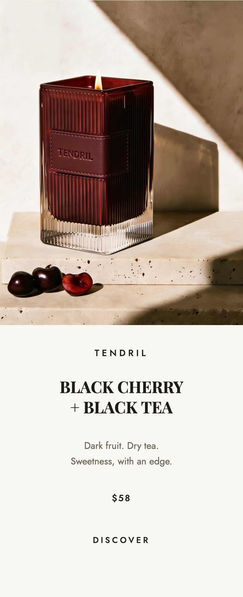
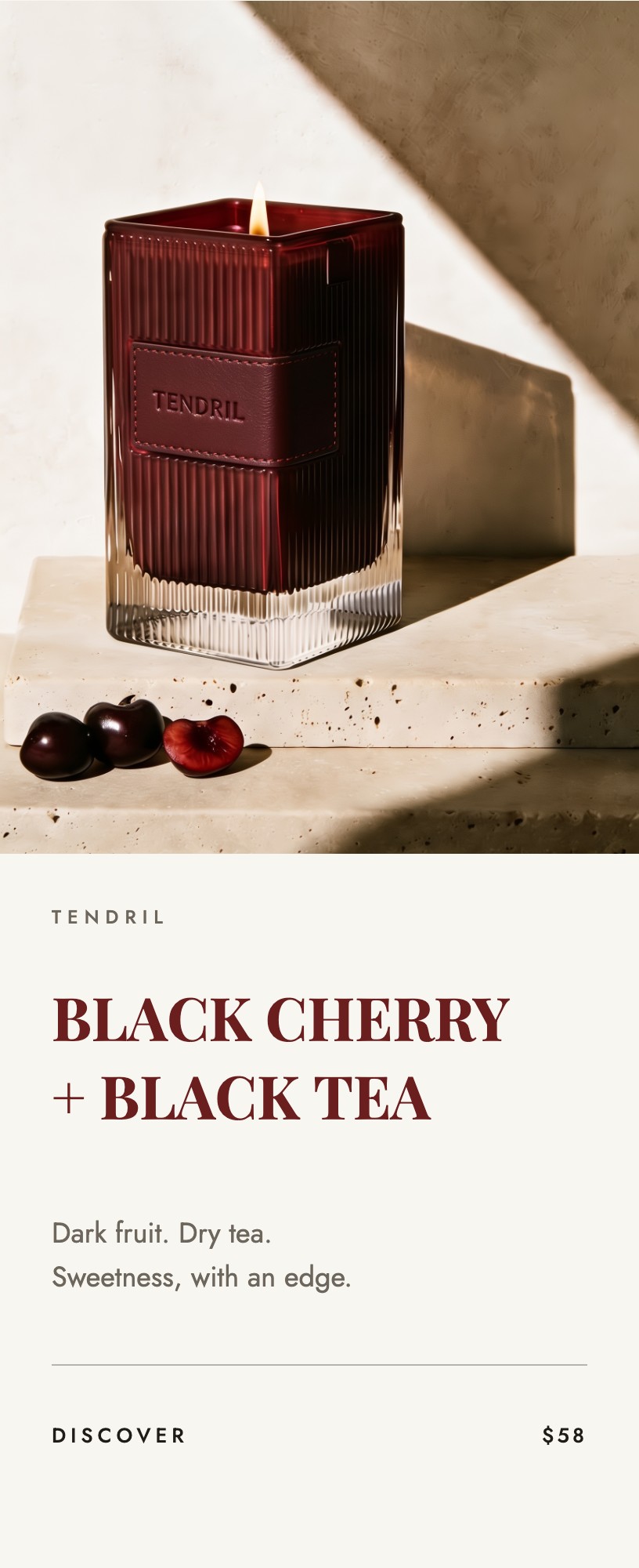
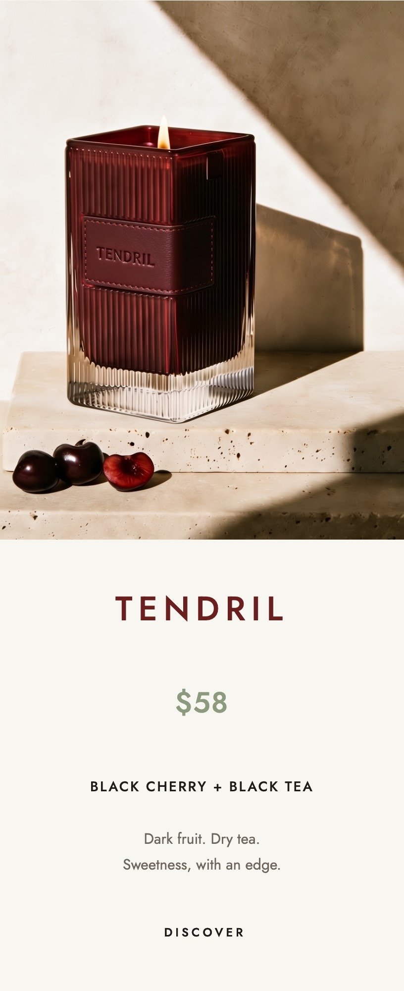
You chose B · Scent leads
The Creative Director’s pick
B creates the clearest reading order.
The brief asks for the scent first, and B delivers that order: scent → product → invitation. Scale establishes it without making the reader think about where to look next.
If the brief were “make Tendril the name people remember,” C would win.
Take the full lesson, free →If everything is important, nothing is important.
Lesson 02 · Typography
One typeface. Six jobs.
The same typeface can create different levels of importance through size, weight, case, spacing, and position. Fewer fonts create less visual competition, making the layout feel calmer and easier to read.
Type a word. Watch all six change.
Try your own word
41 Marrow Lane
You don’t always need another font. Sometimes you need to art direct the one you already have.
Lesson 03 · Audience
“Everyone” is not an audience. It is a way of avoiding the decision.
Knowing who you are speaking to helps you decide what the work should say, show, and emphasize. Below, the product stays the same while the crop, typography, message, price, and context change for each buyer. Notice who each version seems to be speaking to.
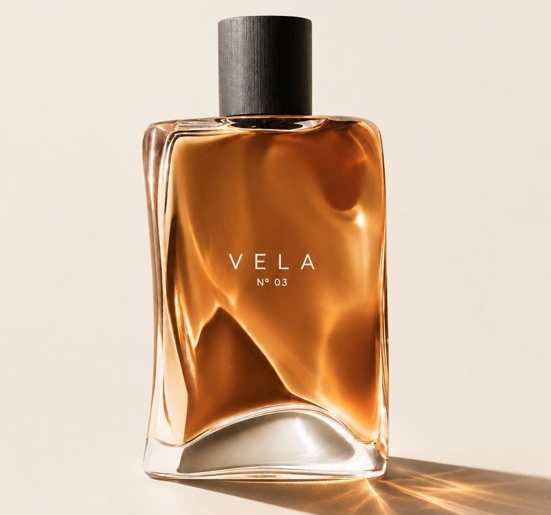
One bottle. Before anyone decides who it is for.
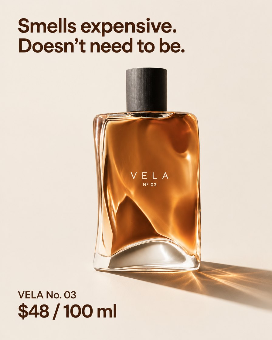


Wide crop. Price leads. Heavy sans serif.B · Quiet enthusiast
Material detail. No price. No promotional headline.C · Gift buyer
The full object in context. Copy built around the occasion.
Knowing your audience helps you tailor the message to the right people.
Lesson 04 · Reference is a skill
People can’t read minds. Bring references — and explain what you like about them.
References help everyone working on a project understand what you are trying to create — the photographer, stylist, makeup artist, set designer, and other art directors. Point to the specific part you want the team to use: the lighting, expression, gesture, styling, composition, or atmosphere. Using a reference does not mean copying the entire image.


Playful expression. Direct flash that catches the jewelry naturally. A gesture borrowed — not a composition reproduced.
Pull references so everyone is on the same page.
The first handbook
See the Work
A practical handbook for seeing, deciding, and directing creative work.
You have sampled the four ideas inside See the Work: directing attention, giving type a job, choosing for a specific audience, and communicating with references. The handbook teaches each idea in full, provides harder comparisons, and ends with prompts you can use on your own work.
Free lesson
Free to read. No sign-up.
More lessons soon.
The handbooks
A series, one way of seeing at a time.
Each handbook stands on its own. See the Work is the first, and the only one available now.
01 — Available
02 — In preparation
03 — In preparation