A free lesson from See the Work, the first TYCE handbook. All of it is here — no sign-up.
What is TYCE? →1
Where did you look first?
If everything is important, nothing is important.
Show / The three-second test
Look at the design for three seconds.
Don’t analyze it. Don’t decide whether you like it. Just notice what caught your eye first.
In design, hierarchy is the order in which information reaches you.
What the first read tells you
You saw the headline.
The first thing you notice reveals what the design is prioritizing — even if that wasn’t the intention. Contrast, scale, color, position, and space can all pull the eye. The question is whether they are pulling it toward the right thing.
Notice it before your opinion takes over.
Look againThe words “Black Cherry, Black Tea” | the headline The candle | the candle The flame | the flame The light and shadow | the light and shadow The cherries | the cherries
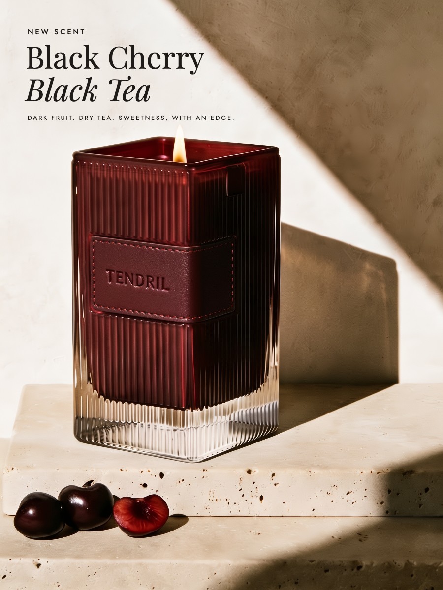
Plate I · Tendril, advertisement under review
B
Compare / The test
Same assets. Different order.
The brief: draw attention to Tendril’s new scent. The photograph and words are identical — only the hierarchy changes. Which version gives your eye the clearest path to what the brief asks for? Choose before you read on.
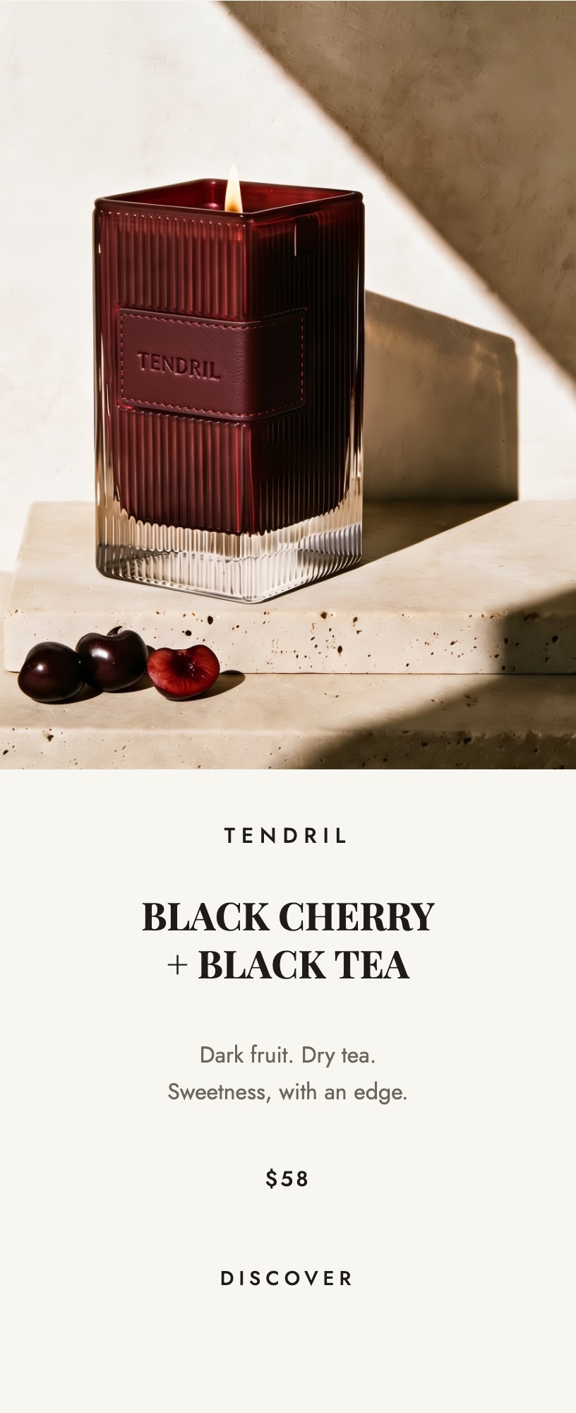
A
Everything equal
The brand, scent, price, and invitation are set at a similar size and weight. Nothing clearly leads.
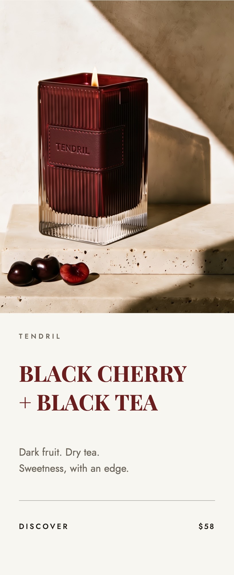
B
Scent leads
The scent is largest. The brand, price, and invitation follow at quieter levels.
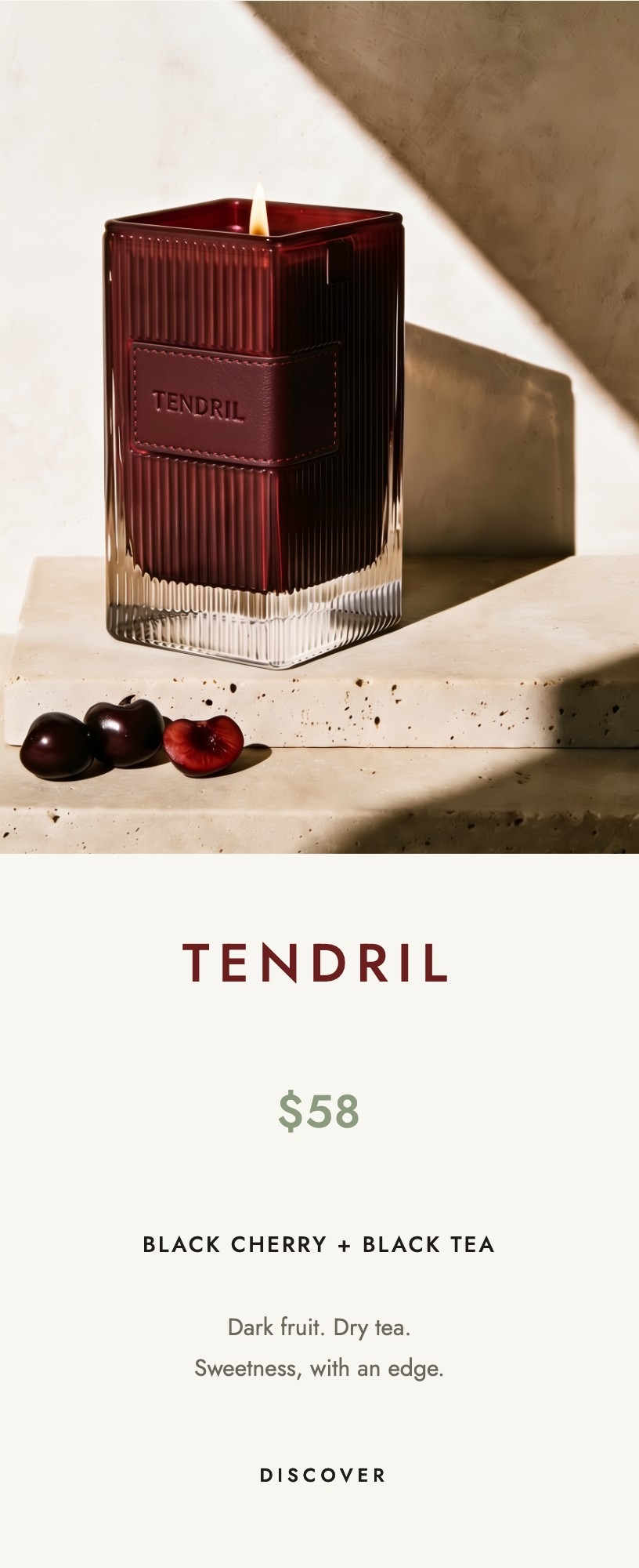
C
Name and price lead
The brand name and price are largest. The scent becomes secondary.
Reveal / The Creative Director’s pick
B creates the clearest reading order.
B does not make everything louder. It creates the order the brief asks for: scent → product → invitation. Scale establishes the order without making the reader think about where to look next.
- First · The scentThe reason someone wants the candle, so it receives the most attention.
- Second · The productThe candle image and the Tendril name show what is being offered.
- Third · The invitationIt can be quiet because it no longer has to compete for attention.
One thing catches your eye first. Two less prominent elements guide you through the rest.
Explain / The principle
If everything is important, nothing is important.
Hierarchy is edited attention. It tells the reader what to notice first, what to understand next, and what can wait.
- Choose the jobBefore you style anything, name the one thing the design must communicate.
- Build distanceMake first, second, and third feel meaningfully different — through scale, contrast, color, position, and space.
- Earn the accentUse the strongest color, shape, or contrast where it has a reason to be. When everything is emphasized, emphasis stops working.
The Vespers name | 5, 10, 22, 5 ZERO PROOF | 5, 19, 46, 18 Full ritual. | 5, 42.5, 24, 4.5 The flavor bar | 5, 48, 38, 6 The bottle | 56, 18, 33, 66 Serve cold | 5, 84.5, 22, 4
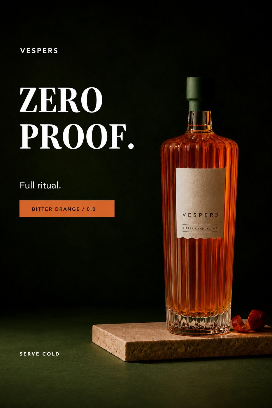
Words gone — the orange bar survives
Vespers · advertisement under review
Try / A harder round
New category. More competing messages.
You have compared three versions where the reading order was already visible. Now diagnose a new advertisement yourself. The category is different, but the question is the same: does the order of attention support the brief? Look at the Vespers ad for three seconds, then tap the first, second and third things you noticed.
The brief
Launch a non-alcoholic aperitif.
Intended order
Product name Zero-proof benefit Serving ritual
What you actually saw
Tap the ad: first, second, third.
Did people notice the information in the order requested by the brief? If not, what would you change first to bring the design in line with it? Then drag the squint slider all the way and see what survives.
Start overReveal / Creative Director’s Diagnosis
The hierarchy doesn’t match the brief.
The orange flavor bar has the strongest color contrast, so it wins the first read. The scale of ZERO PROOF makes it second. The Vespers name is too quiet, even though the brief says the product should lead.
What I would change
Original version.
- Original version.Flavor bar first, ZERO PROOF second, the product name a distant third. The opposite of the brief.
- Make Vespers the first read.The brief asks for the product first, so the name takes the scale. For a moment there are two heroes — which is the next thing to fix.
- Keep zero proof clearly second.It still matters. It just stops competing with the name.
- Reduce the flavor bar’s color contrast and emphasis.So it supports the message instead of leading it. Now the order matches the brief: name, zero proof, serving ritual.
Size isn’t the only thing that determines what people notice first.
A strong color can attract more attention than larger type.
hierarchy-01
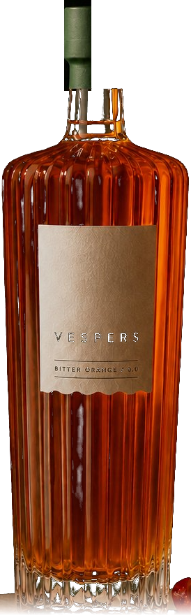
Vespers · rebuilt live from the approved bottle
Apply / A page to keep
Audit your own design.
Pull up something you designed recently. Don’t change it yet. Look at it for three seconds, then ask:
Creative Director’s note
Don’t redesign it yet.
Diagnose the problem first. Make one change, then look again.
- What did I see first?Was it the most important message — or simply the loudest element?
- Where did my eye go next?Is there a clear path through the information, or does the reader have to search for one?
- What is competing for attention?If two things are shouting equally loudly, decide which one actually deserves to lead.
- What can I subtract?Remove, group, or quiet anything that is not helping the message.
- Does the hierarchy support the goal?The prettiest element is not automatically the most important one.
Where this came from
1
If this way of learning helped you see the advertisement differently, See the Work continues with three more lessons on typography, audience, and references. A 33-page landscape PDF, made to be kept open beside the work.